
News
Art21 Extended Play
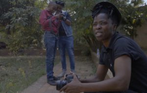
New Video: Zanele Muholi Unplugs from the Studio
Art21 Extended Play
New Video: Zanele Muholi Unplugs from the Studio
Zanele Muholi explains the impetus behind creating what they call “mobile studios” to photograph members of the LGBTI community in South Africa. Freed from the limitations of a single studio space, Muholi travels to the homes and community spaces shared by the people depicted in their photographs.
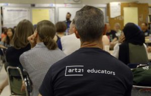
This Week in Art
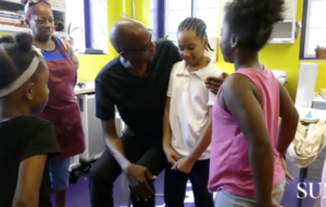
Baltimore Children Get Silk-Screening Lesson from Mark Bradford, Mary Mattingly Takes Over BRIC & More
This Week in Art
Baltimore Children Get Silk-Screening Lesson from Mark Bradford, Mary Mattingly Takes Over BRIC & More
A look at this this week’s art news, including Mark Bradford’s new community-centered project in Baltimore.
This Week in Art
“Art in the Twenty-First Century” Premieres Next Week, Laleh Khorramian Gets Mad at Art & More
This Week in Art
“Art in the Twenty-First Century” Premieres Next Week, Laleh Khorramian Gets Mad at Art & More
A look at this week’s art news, including the latest season of the Art21 broadcast series “Art in the Twenty-First Century” premiering on PBS next week.
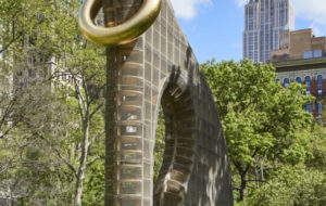
This Week in Art
Martin Puryear to Represent the U.S. in Venice, Cuban Artists Speak Out & Doris Salcedo’s “Counter-Monument”
This Week in Art
Martin Puryear to Represent the U.S. in Venice, Cuban Artists Speak Out & Doris Salcedo’s “Counter-Monument”
A look at this week’s art news, including the recent announcement of Martin Puryear as the artist selected to represent the United States in the upcoming 2019 Venice Biennale.