Road to Freedom: Interview with Julian Cox
by Victoria Lichtendorf | Jun 3, 2009
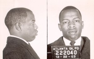
Like many museums, traveling shows tend to dominate the exhibition schedule at the High Museum of Art. In contrast, Road to Freedom: Photographs from the Civil Rights Movement, 1956-1968, organized …