Archive

Monthly Archives: August 2010


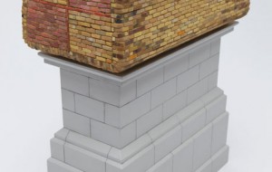
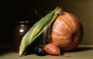
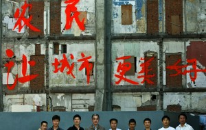
Gastro-Vision
Gastro-Vision: Eating Your Vegetables Is a Luxury
Gastro-Vision
Gastro-Vision: Eating Your Vegetables Is a Luxury
Gastro-Vision launched last August with a two-part post about the trend in urban farming. Interest in sustainable and local food practices continues to spread among creative types and appears to …
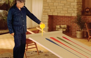
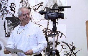
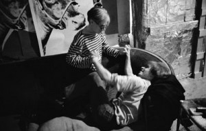
Inside the Artist's Studio
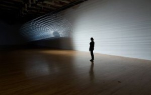
Inside the Artist’s Studio: The Studio Reader and the SAIC Summer Studio
Inside the Artist's Studio
Inside the Artist’s Studio: The Studio Reader and the SAIC Summer Studio
The Studio Reader: On the Space of Artists is the kind of book an artist would eat up in a single sitting. It is about the STUDIO — the spaces …

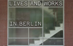
Lives and Works in Berlin
Lives and Works in Berlin: The Sommerpause Art Guide
Lives and Works in Berlin
Lives and Works in Berlin: The Sommerpause Art Guide
Nothing spells houseguest season like late-August in Berlin. With school about to resume and the major art metropolises shut down for summer, the town becomes besieged by the event hungry. …
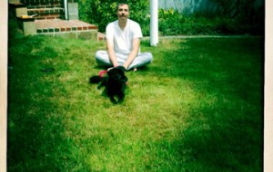
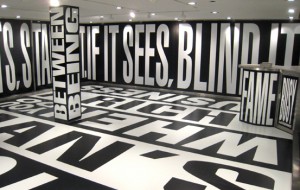
Center Field: Art in the Middle with Bad at Sports.
Frances Whitehead, Embedded Artist
Center Field: Art in the Middle with Bad at Sports.
Frances Whitehead, Embedded Artist
What do artists know? A few weeks ago, I spent an afternoon at the Chicago home of Frances Whitehead talking about the philosophical and pragmatic underpinnings of this question. To …
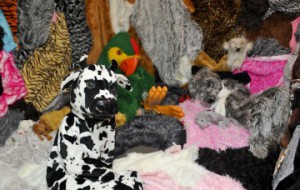
Looking at Los Angeles
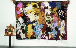
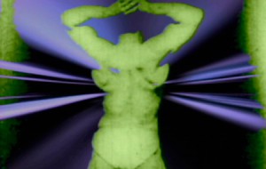
Burn, Baby, Burn: Furries Join Baby Ikki on a Voyage of Growth and Discovery
Looking at Los Angeles
Burn, Baby, Burn: Furries Join Baby Ikki on a Voyage of Growth and Discovery
Last month, I opened my email to find a “Call For Furrie Interns.” The call came from LA artist Marnie Weber and was forwarded to me by a mutual friend …


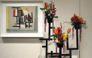
Center Field: Art in the Middle with Bad at Sports.
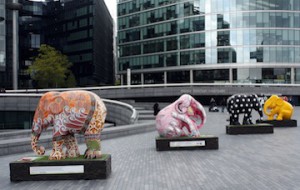
Go West | Roger Brown: California U.S.A
Center Field: Art in the Middle with Bad at Sports.
Go West | Roger Brown: California U.S.A
After passing away in 1997, painter, sculptor, and notorious collector, Roger Brown bequeathed his homes and collections to his alma mater, the School of the Art Institute of Chicago (SAIC). …

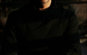
Inside the Artist's Studio
Inside the Artist’s Studio: N. Bernard Viljoen and the Twilight Children
Inside the Artist's Studio
Inside the Artist’s Studio: N. Bernard Viljoen and the Twilight Children
N. Bernard Viljoen is a South African architect based in Johannesburg. He was raised on a farm in the Free State outside the quaint South African town, Parys. He graduated as …