Archive
Monthly Archives: January 2011
Inside the Artist's Studio
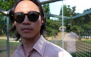
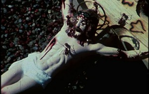
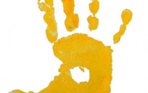
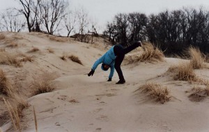
Inside the Artist’s Studio: Ben Durham
Inside the Artist's Studio
Inside the Artist’s Studio: Ben Durham
Turkish and Other Delights columnist Elizabeth Wolfson is filling in for regular Inside the Artist’s Studio writer Georgia Kotretsos this month and next. — Ed. Ben Durham lives and works …
Looking at Los Angeles
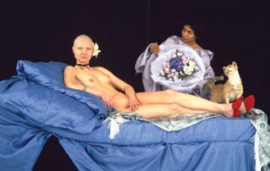
Looking at Los Angeles | The California Biennial: Collectives, Conversations, and Collaborations
Looking at Los Angeles
Looking at Los Angeles | The California Biennial: Collectives, Conversations, and Collaborations
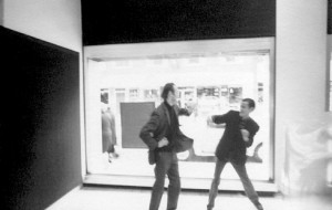
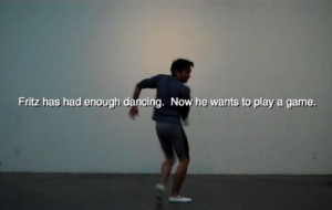
I first experienced the California Biennial in 2008 as a participant in Mary Kelly’s Flashing Nipple Happening. Kelly had recruited around five dozen young women to gear-up in black …
Turkish and Other Delights
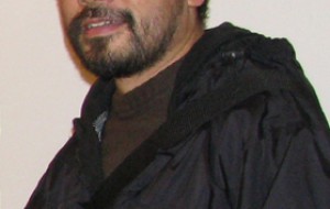
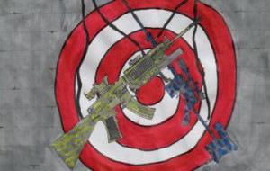
Turkish and Other Delights: Extramücadele/Extrastruggle
Turkish and Other Delights
Turkish and Other Delights: Extramücadele/Extrastruggle
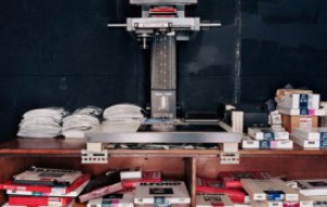
Extrastruggle is an enormous project which began in 1997. It works on imaginary demands from imaginary customers. Just like a graphic designer designing a logo for a client, it designs …
Center Field: Art in the Middle with Bad at Sports.
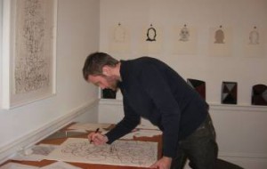
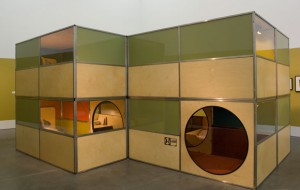
Center Field | Multiple Possibilities: An Interview with Dan Devening
Center Field: Art in the Middle with Bad at Sports.
Center Field | Multiple Possibilities: An Interview with Dan Devening
Dan Devening is an artist, educator (he’s on the faculty of the Paintings and Drawings Department of The School of the Art Institute of Chicago), and the creative force behind …
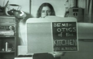
Gastro-Vision
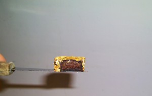
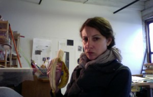
Gastro-Vision: Martha Rosler’s Kitchen Mise-en-Scène
Gastro-Vision
Gastro-Vision: Martha Rosler’s Kitchen Mise-en-Scène
In 2003, the Whitechapel Gallery in London invited Martha Rosler to recreate her classic video Semiotics of the Kitchen (1975) as a live performance. She accepted the invitation by holding …
5 Questions for Contemporary Practice
5 Questions (for Contemporary Practice) with Rigo 23
5 Questions for Contemporary Practice
5 Questions (for Contemporary Practice) with Rigo 23
I first encountered Rigo 23’s work this past summer staying with friends in San Francisco’s Mission, where Rigo 23 partially got his start as an artist through his engagement with …
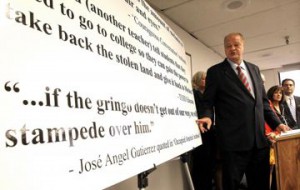
Teaching with Contemporary Art
It Ain’t the Heat, It’s the Stupidity
Teaching with Contemporary Art
It Ain’t the Heat, It’s the Stupidity
As promised last week, let’s talk about the plight Mr. Curtis Acosta finds himself in. As a public school teacher in Arizona, obviously a state with its share of issues …
Open Enrollment
Introducing Open Enrollment’s Newest Writers
Open Enrollment
Introducing Open Enrollment’s Newest Writers
We are pleased to announce Open Enrollment’s incoming class for the Spring 2011 semester. Our newest correspondents will write from their outposts in Helsinki, London, Los Angeles, and NYC, where …

Letter from London
Letter from London | Porn, Porn Everywhere: Analog at Riflemaker Gallery.
Letter from London
Letter from London | Porn, Porn Everywhere: Analog at Riflemaker Gallery.
In this second and last guest blog post, Kerim Aytac fills in for our hero Ben Street this month. — Ed. Looking at Richard Nicholson’s elegiac contribution to the Analog …
Art21 Extended Play
Krzysztof Wodiczko: Designer Adam Whiton
Art21 Extended Play
Krzysztof Wodiczko: Designer Adam Whiton
SUBSCRIBE TO EXCLUSIVE: RSS | ITUNES | YOUTUBE | ARTBABBLE Episode #133: Filmed at the Interrogative Design Group offices at MIT in Cambridge, Massachusetts, designer Adam Whiton discusses his work …
Looking at Los Angeles
Looking at Los Angeles: Big, Broad Bunker Hill
Looking at Los Angeles
Looking at Los Angeles: Big, Broad Bunker Hill
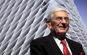
Eli Broad, Los Angeles’s most aggressive philanthropist, nearly always wears solid, primary colored ties. Last Thursday, he wore a red one to unveil the plan for his new museum on …
Turkish and Other Delights
Turkish and Other Delights: An Introduction
Turkish and Other Delights
Turkish and Other Delights: An Introduction
Art21 is pleased to announce our newest column on the blog — the first of several new endeavors for 2011. Turkish and Other Delights is a column devoted to exploring …
Flash Points
Call For Artists: Creative Limitations
Flash Points
Call For Artists: Creative Limitations
The artist-gallery relationship presents a curious contradiction. That is, there is the notion that a gallery representing contemporary artwork has a certain responsibility for promoting challenging and inspiring ideas, whereas, …