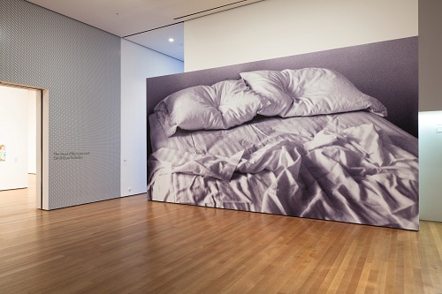
Felix Gonzalez-Torres (American, born Cuba. 1957-1996). “Untitled,” 1991 (installation view at MoMA). Billboard. Dimensions vary with installation. The Museum of Modern Art, New York. Gift of Werner and Elaine Dannheisser. Photograph by Jason Mandella. © The Felix Gonzalez-Torres Foundation, Courtesy Andrea Rosen Gallery, New York.
If Print/Out: 20 Years in Print is any indication, those in the business of print criticism, scholarship, curatorial work, and production will soon be the rarest of breeds. In his highly anticipated survey of the state of the medium, recently-minted Chief Curator of Prints and Illustrated Books Christophe Cherix posits the end of printmaking’s singular identity, announcing a future in which prints “will simply be called ‘art.’” (Print/Out: 20 Years in Print [New York: The Museum of Modern Art, 2012], 27). With these words, he predicts the integration of printmaking into contemporary art practice – a future in which the medium’s essential “reproducibility, capacity for distribution, and … collaborative nature” (ibid.) serves the aims of artists of any ilk (even those who would shun the idea of making prints) while the traditional approach to printmaking as a specialized art form produced in limited editions under the wing of a professional workshop, will fade in importance.
Though Cherix states that the exhibition “embraces the versatile, global, and even muddled nature of contemporary art in the last two decades” (ibid., 15) it in fact presents a fairly unilateral view, privileging conceptual work and unconventional uses of materials. Due to the fact that most of the works are deeply steeped in ideas, a considerable investment of time and contemplation is required of visitors (reading the catalogue essay is mandatory to arrive at a meaningful level of understanding). For example, the first objects to greet the eye are four altered screenprints by Martin Kippenberger titled Inhalt auf Reisen (Content on Tour) (1992), part of a handful of interrelated projects in various formats created in the late 1980s and early 1990s through which the artist questioned the notion of appropriation – following the full trajectory of this work requires an advanced level of mental gymnastics. Depending on one’s proclivity, this can be either thrilling or tiresome; critic Ian Volner of Capital New York, for example, hails the exhibition’s ability to “dilate our sense of print’s potential on and off the page.” This may indeed be the case if one invests the effort required, but even then, there are omissions and questions – when thinking of artists who have stretched the meaning and uses of printmaking in recent years, Richard Tuttle and Nancy Spero come to mind, as do Swoon and Nicola López, but none of these artists, nor any others working in this vein, are represented.
Moving further into the galleries, one is confronted with information overload on the level of Times Square. As described by Ken Johnson of The New York Times, it is “overbearing…[and] has a hectoring, noisy feeling, as if you were being yelled at for the duration of your visit.” To Johnson’s point, the noisy Ben-Day dot leitmotif that punctuates both the exhibition and its accompanying catalogue – designed by the Amsterdam-based team Mevis and Van Deursen – is overwhelming. While the impulse to experiment with presentation is laudable, the motif does little to advance the thesis and frequently drowns out the work itself. For example, Xu Bing’s Series of Repetitions (1987-88) – an early and rare suite of woodcuts that presents a subtle, organic rhythm of abstracted forms resembling biological events or formations – loses out in its pairing with this icon of mechanical reproduction.
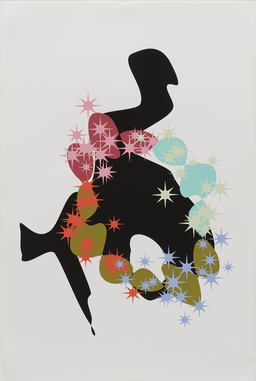
Pae White (American, born 1963). “My Melody” from “Untitled,” 1999. One from a portfolio of six screenprints, 35 15/16 x 24″ (91.3 x 61cm). Publisher: 1301PE, Los Angeles. Printer: Wasserman Silkscreen, Santa Monica. Edition: 20. The Museum of Modern Art, New York. Howard Johnson Fund, 2001. © 2012 Pae White.
In light of the premise of the exhibition, one is confounded by the very presence of work like Series of Repetitions and similarly traditional suites by artists like Julie Mehretu, Thomas Nozkowski, Kara Walker, Pae White, Guillermo Kuitca, Yoshitomo Nara, and Carroll Dunham. The standard approach to printmaking they represent is discussed only briefly in the introductory pages of the catalogue essay and wall text, where it is somewhat vaguely characterized as a model that reached its apex in the past (see ibid., 14-15). (Most of the attention devoted to print workshop activity is relegated to Print Studio, a concurrent series of educational programs, with some discussion in the audio tour.) In this context, one is left to assume that they offer a renewal of an arrière-garde approach to printmaking, though it is still unclear why these artists were selected or why the particular work was chosen among the sizeable body of prints each of them has produced (arguably, more innovative examples could have been offered in almost every case). Likewise, the only traditional printer/publisher to receive significant attention in Print/Out is Jacob Samuel – an intaglio printer who has radically adapted his approach to allow him to visit artists in their studios and make prints in situ; the exhibition thus suggests that other publishers must likewise evolve or perish.
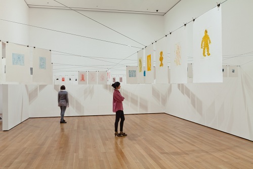
Thomas Schütte (German, born 1954). “Low Tide Wandering (Wattwanderung),” 2001 (installation view at MoMA). Portfolio of 139 etchings (exhibition set). Plate: variable; sheet (each approx.); orientation varies: 12 11/16 x 17 5/8″ (32.2 x 44.7 cm). The Museum of Modern Art, New York. Sue and Edgar Wachenheim III Fund and Gift of the Contemporary Arts Council of The Museum of Modern Art. Exhibition copy on view: courtesy the artist. © 2012 Artist Rights Society (ARS), New York / VG Bild-Kunst, Bonn. Photograph by Jason Mandella.
Moving beyond such mixed signals, Print/Out presents a core of works that inspire with their out-of-the-box thinking and unorthodox uses of print techniques – as the foci of Cherix’s essay, these are presumably the works that indicate the future of the medium in his view. An iconic example is Felix Gonzalez-Torres’ Untitled (1991) billboard (illustrated top), an enlarged photograph of an empty and rumpled bed for two – an elegy to the lover he lost to AIDS (illustrated top). The generic image, which implies universality in its lack of specificity, places the personal cost behind the disease at the forefront, raising public awareness of this often overlooked aspect of the epidemic. As it was originally, the work is displayed in several locations throughout New York City, including the entrance to the exhibition. Another example of private experience made public is Thomas Schütte’s Low Tide Wandering (Wattwanderung) – comprised of 139 small etchings that occupy an entire room of the exhibition. In an unconventional approach, Schütte switched to the laborious medium of intaglio to record his daily thoughts. In a very different way, Rirkrit Tiravanija’s prints and multiples also serve as a record of personal experience – providing material evidence of his performance-based work, which is intimate, participatory, and ephemeral in nature. An artist’s book by Matt Mullican made with graphite rubbings and screenprint, and a series of 100 monotypes by Josh Smith, demonstrate the ways printmaking can be employed to create unique works that have a messy, gestural aesthetic.
Many of the works in Print/Out show how artists/publishers have employed commercial formats of printing and distribution to promote ideas. The most subversive of these is Chinese dissident/artist Ai Weiwei’s three-volume series on the history of contemporary Western art that was clandestinely printed and distributed in defiance of Chinese censorship laws. By contrast, similar publications produced in the West celebrate freedom of speech and the press. For example, Vienna-based publisher museums in progress [sic] commissions artists to present original work in newspapers, billboards, on television, and on the internet. Taking the idea of an artist-fueled publication to the extreme, Maurizio Cattelan, Dominique Gonzalez-Foerster, and Paola Manfrin created Permanent Food (1996-2007), a non-profit artists’ magazine that reprinted appropriated images from other mass-produced magazines, selected by various artists. Aleksandra Mir, on the other hand, used the familiar format of a postcard to disseminate her work at the 2009 Venice Biennale, providing official stamps and mailboxes. Damien Hirst’s The Last Supper appropriates labels for patented pharmaceuticals, replacing the brand name of the drugs with those of common foods (and the company’s name with the artist’s) while Lucy McKenzie borrows design elements from bygone eras, layering and juxtaposing them in unexpected ways to uncover their subconscious associations. The exhibition also includes selections from Robert Rauschenberg’s The Lotus Series (2008), his last suite of prints; as the progenitor of appropriating commercial imagery for fine-art means, his placement at the back of the exhibition space seems peculiar.
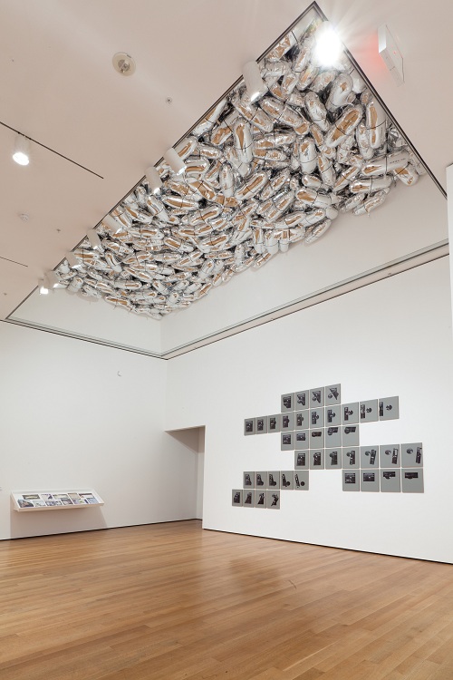
Installation view of “Print/Out” at MoMA. Ceiling: General Idea (Artist group, active 1968-1994). “Magi© Bullet,” 1992. Installation of custom-shaped Mylar balloons, dimensions variable. The Museum of Modern Art, New York. Gift of Mark Krayenhoff. © 2012 General Idea. Right wall: Kelley Walker (American, born 1969). “Andy Warhol Doesn’t Play Second Base for the Chicago Cubs,” 2010. Series of 39 screenprints on MDF panels. Each: 17 1/4 x 13 x 3/4″ (43.8 x 33 x 1.9 cm); composition: variable; installation: variable. The Museum of Modern Art, New York. Committee on Prints and Illustrated Books Fund with additional support from Katharina Faerber and the Print Associates Fund in honor of Deborah Wye. © 2012 Kelley Walker. Photograph by Jason Mandella.
Print/Out also includes a number of objects and experiences that offer immediate gratification in the tradition of Pop art. Carefree and crowd-pleasing projects by collectives like Slavs and Tartars (posters in bold colors and fonts with pithy, witty word play); General Idea (custom shaped and printed silver-Mylar balloons, inflated with helium and floating on the ceiling); and SUPERFLEX (a do-it-yourself designer lamp station) provide respite from the densely philosophical and/or meditative art represented elsewhere. On the second floor print galleries, Printin’ – a sister exhibition of prints, paintings, drawings, multiples, films, installations, and sculptures co-organized by Ellen Gallagher and Associate Curator Sarah Suzuki – offers a number of formal, technical, and conceptual entry points into Gallagher’s seminal portfolio DeLuxe (2004-05), which is placed at the heart of the galleries. Like previous artist-curated exhibitions at MoMA and elsewhere, Printin’ provides a fascinating, engaging, and fresh approach to the interpretation of the collection.
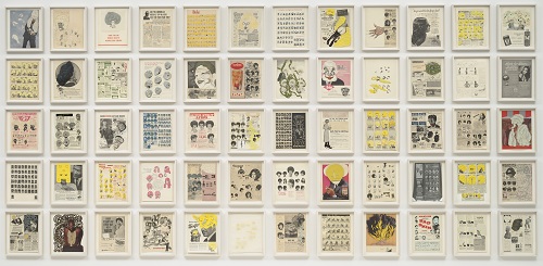
Ellen Gallagher (American, born 1965). “DeLuxe,” 2004–05. Portfolio of sixty photogravure, etching, aquatint, and drypoints with lithography, screenprint, embossing, tattoo machine engraving, laser cutting, and chine collé; and additions of plasticine, paper collage, enamel, varnish, gouache, pencil, oil, polymer, watercolor, pomade, velvet, glitter, crystals, foil paper, gold leaf, toy eyeballs, and imitation ice cubes, overall: 84 x 167″ (213.4 x 424.2 cm); each: 13 x 10 1/2″ (33 x 26.7 cm). Publisher and printer: Two Palms Press, New York. Edition: 20. The Museum of Modern Art, New York. Acquired through the generosity of The Friends of Education of The Museum of Modern Art and The Speyer Family Foundation, Inc. with additional support from the General Print Fund. © 2012 Ellen Gallagher and Two Palms Press.
As noted by Cherix himself, any survey of contemporary art over a period of several years will be flawed in some manner (see ibid., 15). However, it has become a requisite exercise for head curators of the Department of Prints and Illustrated Books at MoMA – an institution whose holdings in the category of contemporary prints are peerless, staffed with a team of several curators for its interpretation (Cherix was assisted by Associate Curator Sarah Suzuki and Curatorial Assistant Kim Conaty in the organization of Print/Out and its related programs and exhibitions). Due to the significance and status of the collection, such exhibitions tend to hold great gravitational pull in the field. The surveys compiled by Cherix’s predecessors Riva Castleman (Printed Art: A View of Two Decades, 1980) and Deborah Wye (Thinking Print: Books to Billboards: 1980-1995, 1996) each set a tone for the interpretation of the contemporary print in their own way, presenting an optimistic and diverse view of the future of the medium. Print/Out, while widening the scope in some respects, underserves the massive and diverse body of work that has been published by numerous fine print workshops throughout the world in the past twenty years, favoring instead a somewhat gimmicky use of techniques toward conceptual ends. While this has certainly been an interesting development in the past few decades, it is hard to imagine that it will eclipse the vital tradition of the limited fine art print, an art form that has its roots in the Renaissance, holds relevance today, and will likely continue to do so.
Pingback: MoMA | Print/Out « History of Printmaking
Pingback: The Art21 Blog’s Most-Viewed Posts of 2012 | Art21 Blog
Pingback: MoMA’s Print/Out « PRINTERESTING