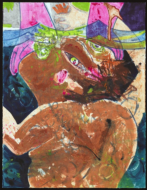
Dana Schutz. “Brünnhilde,” 2011. Watercolor monotype with colored pencil, crayon, and pastel on Lanaquarelle watercolor paper. 46 x 60 in. Image courtesy Two Palms, New York.
Dana Schutz is widely celebrated as one of the most important artists to have emerged in the past decade, renowned for her vivid, humorous, disturbing, and challenging figurative images that provoke fundamental questions about contemporary existence. The artist rose to prominence in the early aughts for her series of paintings of Frank, the last man on earth, a dazed anti-hero who wanders aimlessly through a tropical island landscape. She followed with the Self-Eaters series of 2003-04, which depicts a race of imaginary beings who re-generate themselves with their own parts, either ingesting their own bodies or constructing new limbs from foreign materials. Later, in paintings such as Singed Picnic, she created images of people engaged in normal activities whose bodies are partially burnt away, carrying on as if nothing unusual has happened. In the artist’s own words, “taking death out of the equation” in such images opens the dialogue to a more imaginative space – what would such activity look like? (Dana Schutz: If the Face Had Wheels [Munich: Prestel, 2011], 87). Giving life to original thoughts such as these, Schutz brings viewers into an alternative world that posits situations and problems that could only exist in fictive images, but yet manages to have resonance with the anxious and unmoored ethos of modern life.
Like her self-eaters, Schutz reinvents herself as an artist every few years, morphing into a new branch of endeavor born from the last. Her most recent body of work – a series of large watercolor monotypes created at Two Palms, New York – is certainly unexpected. Though she is a prolific painter, Schutz has created few prints. After an initial spurt of printmaking activity in 2005 (a suite of three woodcuts published by the Neiman Center for Print Studies at Columbia University and an edition for Parkett), Schutz has made a only a handful of editions, all for charitable causes –one would be forgiven for assuming printmaking was not a mode of expression she favored. As such, the new work is something of a revelation, not only within Schutz’s oeuvre but also within the medium of monotype itself, offering an uncommon richness and palpability for works in this technique.
The project came about in early 2011 when she and David Lasry, founder of Two Palms, talked at the opening for Elizabeth Peyton’s exhibition at Gallery Met at Lincoln Center, the first in a series of four exhibitions to coincide with the Metropolitan Opera’s new production of Wagner’s Ring Cycle (Der Ring des Nibelungen), for which artists were invited by gallery director Dodie Kazanjian to create new bodies of work in response to the composer’s magnum opus. Two Palms had produced the prints and monotypes for Peyton’s exhibition, and Schutz expressed that she would also like to work at Lasry’s workshop to create prints for her own imminent exhibition in the same space, the final in the series. Inspired by the last opera of the cycle, Götterdämmerung (The Twilight of the Gods), Schutz’s exhibition opened earlier this year and is now on view through May 12.
Schutz had originally intended to make large woodcuts, but Lasry encouraged her to first experiment with woodcut monotype to develop her ideas, a technique the studio first developed for Carroll Dunham about eight years ago. In this process, the artist works on a sheet of wood rather than traditional metal or plastic. The rough, porous surface impacts the final outcome, both holding more pigment and adding texture and wood grain patterning to the final image. In order to prevent the media from soaking into the surface, the wood is first coated with gum arabic. Once treated, the artist can then draw or paint on the surface with virtually any water-based or dry medium. When the image is final, the surface is dried completely and the wood panel is placed on Two Palms’ industrial hydraulic press with a sheet of damp paper over it. The water in the paper combined with the extreme pressure of the press fuses pigment, paper and gum arabic, lifting nearly every trace of the artist’s work. The gum arabic, which is a binder, allows for areas of thick impasto while also supporting luminous and delicate passages. Though most of the materials are lifted, a “ghost” remains, which can be reworked and overlaid with new media in a variant of the prior image. This makes the technique ideal for creating a body of related, but entirely unique images.
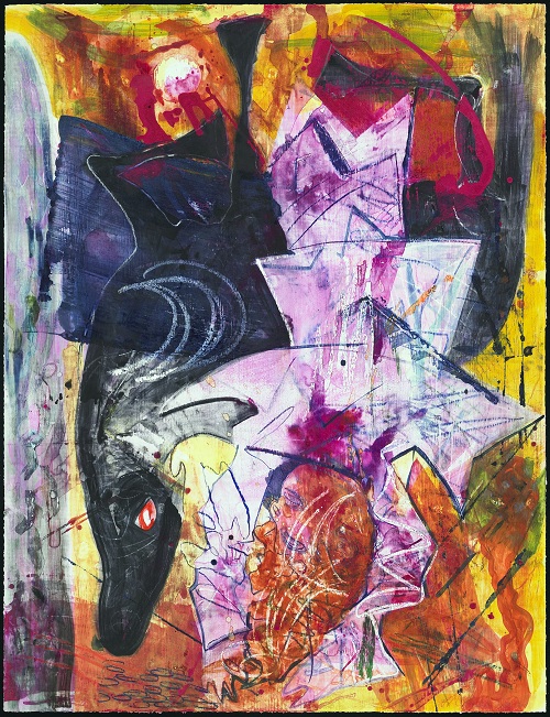
Dana Schutz. “Drowning” 2011. Watercolor monotype with colored pencil, crayon, and pastel on Lanaquarelle watercolor paper. 46 x 60 in. Image courtesy Two Palms, New York.
After making a few of these, Schutz was captivated by the effects and realized that the potential for variations on a theme was ideally suited to the assignment. Abandoning her original intention, she instead created about twelve large watercolor monotypes. Each of the resulting images are highly-worked, developing the technique’s full potential and range of expression. They are definitely recognizable as her own – exhibiting the controlled chaos, saturated hues, dense layering, and flattened illusionistic space of her work on canvas – but the water-based media lends a translucence and vibrancy that represents a new direction. As is often the case with successful printmaking projects, her experience with this technique has affected how she thinks about painting in the studio. She says, “The process is extremely sensitive so every decision, trace and vapor shows up in the final print. It is also very direct – you draw and paint directly on the plywood, so it felt similar to working on a painting. The process can be really physical you can scrape and spray them and also use crayon, loose pigment and pencil, anything really. I found that it really opened up how I thought about making paintings” (e-mail interview).
Schutz’s own extravagantly creative and somewhat outlandish imagination, as well as her exuberantly gestural style, is well-matched to Wagner’s outsized narrative and grandiloquent score. Yet the artist took the assignment as a general guideline, noting, “…I worked only loosely from the themes in Götterdämmerung. Most of the images came from drawings in the studio. After drawing for many hours you start to forget the story and focus on the specifics of how to make an image work. I hadn’t seen the production at the Met Opera before I started making the work so that made it easier to imagine what these characters could look like and be doing” (ibid.). Some of the work is clearly related to the story line, such as Drowning, Fire Girl, Brünnhilde, and Young Brünnhilde (all on view at Gallery Met). Other images, such as Flasher (seen at Two Palms’ Armory Show booth last month) and Licking a Brick (at Gallery Met) are more in line with the artist’s prior work. In addition to the monotypes, Schutz also made a number of ink drawings for the Gallery Met exhibition; two large images are on view in the gallery space, five smaller ones are on the Grand Tier of the lobby, accessible only to ticket-holders.
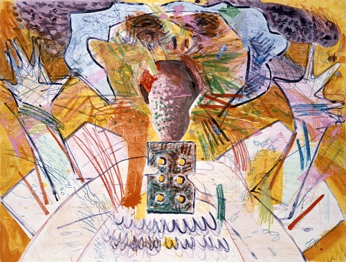
Dana Schutz. “Licking a Brick,” 2011. Watercolor monotype with colored pencil, crayon, and pastel on Lanaquarelle watercolor paper. 46 x 60 in. Image courtesy Two Palms, New York.
Brünnhilde, the Valkyrie daughter of Wotan, King of the Gods, is among the most famed of heroines, and Schutz seems to have been particularly fascinated with her. The princess is the subject of two monotypes and two drawings, and appears in a number of others. Young Brünnhilde, in fact, so resembles Schutz that it could be mistaken for a self-portrait with a horned helmet – the woman’s face, and cropped, red, curly hair are all distinctly the artist’s, and the contemporary orange sweater is incompatible with traditional costume for the Norse goddess. In addition, the subject’s mysterious saucer-like, periwinkle-toned eyes suggest one possessed of a vision; while this is certainly the case for Brünnhilde, it is also true of Schutz. The painter is celebrated not only for her extraordinary imagination, but also her sophisticated understanding of the illusionistic fiction of pigment on canvas/paper, which she manipulates with great skill and wit. Like the valiant warrior princess of Wagner’s opera, who saves the world of the gods, Schutz has been credited with rescuing traditional painting from irrelevance in a contemporary art world dominated by multi-media and performance art.
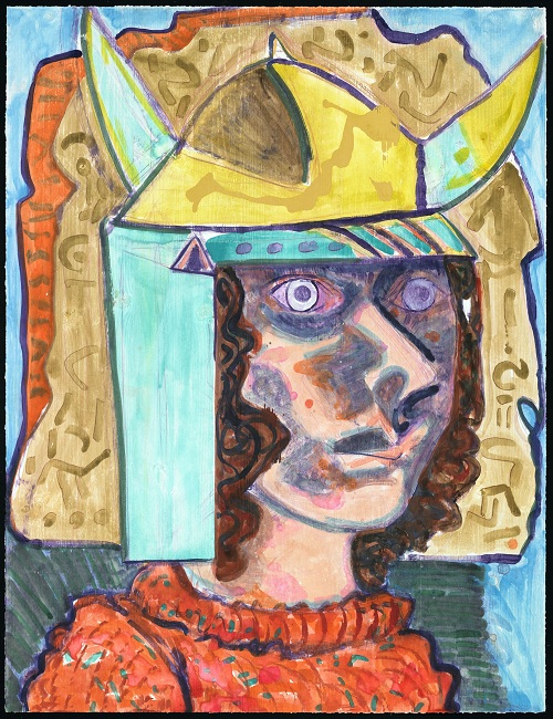
Dana Schutz. “Young Brünnhilde,” 2011. Watercolor monotype with colored pencil, crayon, and pastel on Lanaquarelle watercolor paper. 46 x 60 in. Image courtesy Two Palms, New York.
While elevating Schutz as the savior of painting may be hyperbole (the death of painting has been foretold for decades, but painters have continued to reinvent the technique for contemporary audiences), it is certainly true that her images – which deftly play off of those who have come before but are entirely unique – have particular resonance and staying power. Jonathan Safran Foer, himself a wunderkind, goes as far as to proclaim her a genius in his glowing introduction for Dana Schutz, a monograph published last year by Rizzoli. In his essay for the same publication, Barry Schwabsky likens her to Emily Dickenson and says she “could be the most contemporary painter of all today” (“Autopoiesis in Action” in Dana Schutz [New York, Rizzoli, 2001], 11). Likewise, art historian Cary Levine writes that Schutz gives form to the “madness of ‘normal life’…her bizarre alternative universes rattle the soul, not just because they are so outrageous or repellent, but because they are comparable to ours in undeniable and revealing ways” (Dana Schutz: If the Face Had Wheels [Munich: Prestel Publishing, 2011], 21). Such praise can be stifling, but Schutz has been showered with accolades since her debut nearly ten years ago. She seems to take it in stride, approaching her task as an artist with a very matter-of-fact attitude that is apparent in interviews (such as the one conducted by curator Helaine Posner in If the Face Had Wheels, or Mei Chin’s interview with the artist in Bomb 95, spring 2006). The new monotypes prove that she continues to be an inventive, surprising, and brilliant artist, and will likely continue on the extraordinarily inventive path she has established for her art into the future.
Upcoming exhibitions:
Schutz’s debut show with Friedrich Petzel Gallery, Dana Schutz: Piano in the Rain, opens Wednesday, May 2 with a reception from 6-8, and will be on view through Saturday, June 16.
Dana Schutz: If the Face Had Wheels, a traveling survey exhibition with accompanying catalogue, will be on view at the Denver Art Museum from November 10, 2012 – January 13, 2013. The exhibition was organized by the Neuberger Museum of Art, Purchase College, State University of New York.
Pingback: Ink | Brilliance Under Pressure: Dana Schutz’s Monotypes at Gallery Met | Art21 Blog | Boy van de Laar
Pingback: All Hallows’ for the Print World: New York Print Week | Art21 Blog