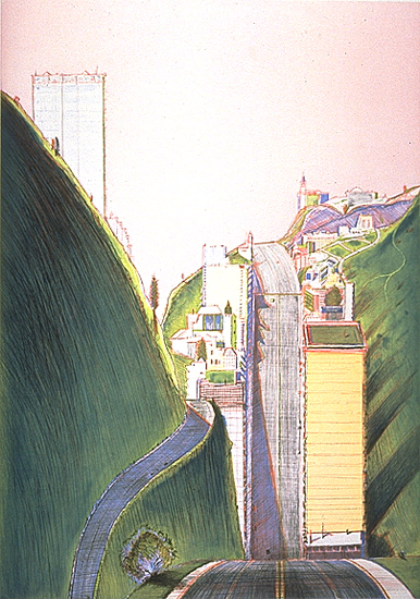
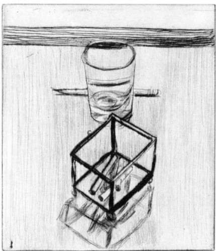
Wayne Thiebaud. “Park Place,” 1995. Color hard-ground etching with drypoint, spit-bite aquatint, and aquatint. Plate: 29 ¼ x 20 ½ in., sheet: 39 ½ x 29 ¾ in. Publisher and printer: Crown Point Press, edition of 50. Image courtesy Crown Point Press, San Francisco.
In 1959, young Kathan Brown stepped off of a freighter in San Francisco with an antique intaglio press and expert printing skills to match. Freshly trained in the French hand-wiping technique of intaglio printing (which, she frequently notes, differs in its precision from the expressive approach then dominating American color etching) at the Central School of Arts and Crafts in London, Brown possessed tireless dedication to her chosen medium. She remains today a self-proclaimed “proselytizer for etching” (e-mail interview) and this passion has guided both her professional activities as well as that of her press. It also transformed the history of intaglio printmaking.
The art scene in the Bay Area was small but robust when she opened Crown Point for business in a Richmond storefront in 1962. In addition to a handful of professional museums and galleries, there were a number of important artists on faculty at the newly renamed San Francisco Art Institute (formerly the California School of Fine Arts); among the most prominent of these was Richard Diebenkorn. As luck would have it, he was looking for a technique that could provide a fresh perspective to his work and decided to further explore drypoint, a medium in which he had previously dabbled. He had heard about Crown Point’s weekly life drawing sessions, where participants drew directly on a metal plate with a needle, and called Brown to join the group. The printing did not interest him (it was a task he happily assigned to Brown), but the challenge of working on the reflective and unwieldy surface did. After awhile, Brown offered some prepared plates for his use in the studio. The result was the press’s first publication, 41 Etchings Drypoints, issued in 1965 in an edition of 25, which began a long relationship between printer and painter that endured nearly three decades until Diebenkorn’s death, producing some of the most astounding color aquatints of our time, including Large Bright Blue, 1980, Green, 1986, and High Green, versions I and II, 1992.
Richard Diebenkorn,.“#19,” from “41 Etchings Drypoints,” 1963. Drypoint. Plate: 7 ¾ x 6 ½ in. Publisher and printer: Crown Point Press, edition of 25. Image courtesy Crown Point Press, San Francisco.
Brown recounts these and other events over the 50-year history of the press in her newly released memoir, Know That You Are Lucky, which she says is “mainly about what I’ve learned and how I’ve learned it” (e-mail interview). (The press’s golden anniversary is also being celebrated in exhibitions at the National Gallery of Art, the Fine Arts Museums of San Francisco, and the press’s gallery, details below.) Indeed, Crown Point’s success is partly a result of fortuitous circumstances and timing. However, solely couching its current stature in terms of destiny is a disservice to Brown’s remarkable achievement: it will not escape the reader that her dedication, perseverance, courage, searching intellect, collegial nature, and keen eye have made it the influential workshop it is today. As she shows, Crown Point’s path to being a for-profit professional publisher was not easy or direct, particularly in the early years, when she supplemented her small business income with odd jobs and teaching gigs, printing for — and renting studio time to — local artists, and hosting printmaking societies and artists’ groups, all while raising a young son on her own. A number of location changes, logistical obstacles, financial troubles, economic dips, and even natural disasters have imperiled its existence at various times; progress was incremental and recognition equally hard-earned.
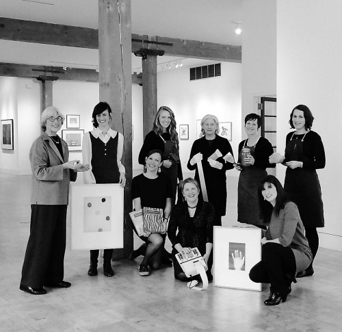
Crown Point Press staff, 2011. Standing, from left: Kathan Brown, Tiffany Harker, Asa Muir-Harmony, Mari Andrews, Ianne Kjorlie, and Emily York. Kneeling, from left: Sasha Baguskas, Stacie Scammell, and Valerie Wade.
A press’s reputation finally rests with the artists with whom it works and in this regard Brown has been both fortunate and astute. In 1970, she was contacted by New York publisher Bob Feldman of Parasol Press (his first year of business) to work with Sacramento-based painter Wayne Thiebaud on a few etchings to be included in Seven Still Lives and a Rabbit, a mixed-media portfolio. Thiebaud had already worked with Brown (she printed and published his 1965 portfolio Delights), and wanted to do so again. Feldman’s knowledge of the medium was limited to line-etching and he was not a fan, but acquiesced. The resulting prints, Big Suckers and Triangle Thins, opened Feldman’s eyes to the tonal effects that can be achieved with aquatint – he was so astounded and pleased with Brown’s work that he began to send New York artists to work at Crown Point: first Sol LeWitt, then Brice Marden, Chuck Close, Robert Mangold, Dorothea Rockburne, and others. By the late 1970s, Brown had achieved enough financial stability to loosen ties with Parasol and infuse new energy into the press’s own publishing program, which has been consistently innovative and forward-thinking. By the late 1970s, she had achieved enough financial stability to loosen ties with Parasol and infuse new energy into the press’s own publishing program, which has been consistently innovative and forward-thinking.
Over the years, Crown Point has worked with artists from around the world who represent a vast array of approaches and perspectives, from the vibrant formal abstractions of Diebenkorn, Mary Heilmann, Helen Frankenthaler, and Tomma Abts to the ideas-based works of John Cage, Tom Marioni (who became Brown’s husband), Joan Jonas, Vito Acconci, Hans Haacke and Daniel Buren. While maintaining a global scope, Crown Point has also sustained a deep connection with Bay Area artists, particularly Diebenkorn, Thiebaud, Robert Bechtle, and William T. Wiley. It has also often published Los Angeles-based artists such as Ed Ruscha, John Baldessari, Laura Owens, Chris Burden, and Edgar Bryan. Brown is again self-effacing in discussing the press’s cadre of artists, stating in an interview earlier this year, “it seems like artists have selected us more than we selected them…it’s kind of a snowball thing” — but choices were nonetheless made, undoubtedly fueled by Brown’s broad intellectual interests. Commenting on her varied experiences she states, “In the spectrum of art being made during the time in which we are living, there are a lot of wavelengths, and one of art’s pleasures, to me, is getting on one of those wavelengths with an artist” (Know That You Are Lucky, 280).
Another factor in a workshop’s success is its ability and willingness to experiment and go to extreme measures to bring the artist’s vision into reality. In a recent lecture at the Fine Arts Museums of San Francisco, Brown stated that Crown Point’s ability to do this does not come solely from technical knowledge, but an attitude of “concentration and flow and care and attention.” She also recounts many technical struggles and triumphs in her memoir; among the most celebrated of these is Crown Point’s first project with Chuck Close (which was also his first print) – a mezzotint entitled Keith, 1972. Close had chosen to work with this challenging and antiquated technique, a proclivity that has since guided much of his work in printmaking. Brown told him that it was best suited to small-scale compositions of only a few inches: Close replied, “maybe I could go down to about three by four feet” (Know That You Are Lucky, 65). Brown describes the scene after several failed efforts to prepare a plate of this size, involving a number of staff members: “We all sat silently in a cloud of despair…`Well,´ I said, `at least the next one has to be perfect. There’s nothing else that could possibly go wrong´” (ibid., 67). Most went home, but Brown, one of her master printers, and her 10-year-old son stayed on in a last attempt, finally achieving success near midnight. Further complications arose as Close was working on the plate, resulting in uneven wear in the mouth and nose area, but the print was considered a success and it is now counted among the major achievements in the history of contemporary printmaking.
In the following years, Brown delved further into the challenges of finding ways to make etching — which she characterizes as “an antiquated medium” (FAMSF lecture) — a viable mode of expression for contemporary artists. She has embraced technical challenges throughout her career, often inviting photographers, sculptors, performance artists, conceptual artists, and composers who were not accustomed to working in two dimensions to work at the press. In the eighties, Crown Point also embarked upon a publishing venture that paired artists with traditional printers in Japan and China that allowed them to explore the historic printmaking techniques of those nations. In the nineties, the press revived photogravure, a nineteenth-century process in which photographic imagery is printed with intaglio techniques. They have since worked with a number of photographers and artists to expand and deepen that program, including Darren Almond, Susan Middleton, and John Chiara.

Darren Almond. “Fullmoon@Rwenzori: Mountains of the Moon,” 2010. Color photogravure. Plate: 20 x 20 in.; sheet: 29¼ x 28½. Publisher and printer: Crown Point Press, edition of 10. Image courtesy Crown Point Press, San Francisco.
All the while, Brown has maintained a rigorous education and outreach program that includes workshops, publications, conferences, and a separate technical website, Magical Secrets (also the title of the intaglio instructional manuals the press has published). One of her most influential educational activities is the internal training program for master printers, a process that takes three years. There have been thirty to date, nearly half of whom have moved on to establish their own presses, including Paulson Bott Press, Lothar Osterburg Photogravure, and HuiPress. This, along with the manuals and workshops, has universally changed the nature of color intaglio printmaking over the past few decades to the point that the French inking method in which Brown trained is now the standard. Concurrent to its fine art publishing and educational activities, the press maintained a gallery in New York from 1985 to 1994 and published two magazines/journals: Vision (1975-82), an avant-garde art magazine edited by Marioni that included original work by Conceptual artists; and View (1978-92), a series of interviews with contemporary artists. Now, like many presses, Crown Point issues a periodic newsletter titled Overview – recent issues can be downloaded on the website. In addition, Brown has maintained a distinct writing practice of her own, including illustrated travel memoirs (Voyage to the Cities of the Dawn, 1976; The North Pole, 2004); philosophical musings on art (A Discussion of Meaning, 1979; A Discussion of Beauty, 1980; Why Draw a Live Model?, 1997; Why Draw a Landscape?, 1999); and instructional manuals and accounts of her experiences working with artists (Ink, Paper, Metal, Wood: Painters and Sculptors at Crown Point Press, 1996; John Cage Visual Art: To Sober and Quiet the Mind, 2001; the Magical Secrets series, 2006-09).
John Cage. “Eninka #42,” 1986. Smoked-paper monotype with branding on gampi paper chine collé. 24 ½ x 18 ½ in. Publisher and printer: Crown Point Press, unique. Image courtesy Crown Point Press, San Francisco.
The artwork that Crown Point has published over the decades has been celebrated in a number of exhibitions in the past, particularly at notable milestones: the twenty-fifth anniversary was marked by a retrospective at the Museum of Modern Art in 1987 while the thirty-fifth year of the press was honored in 1997 both at the National Gallery of Art and Fine Arts Museums of San Francisco (the National Gallery’s website maintains an online feature of its exhibition). Both the NGA and the FAMSF have historically been strong supporters of the press, and each is again celebrating Crown Point’s fiftieth. The National Gallery began last summer with John Cage: Rocks, Paper, Fire, an exhibition that featured selections from Crown Point’s 15-year relationship with the noted thinker and composer. (For Eninka, a series of monotypes, he lit fires on the press – one is illustrated above.) Next fall, the NGA will mount Yes, No, Maybe: Artists Working at Crown Point Press (September 1, 2013–January 5, 2014), which will highlight the trial-and-error process that has attended many of the press’s most lauded editions.
On the west coast, the Fine Arts Museums of San Francisco recently closed Chuck Close and Crown Point Press: Prints and Processes, which included Leslie, 1986, an ukiyo-e style woodcut that was produced through Crown Point’s exchange program with Japan. Currently on view through February 17 is Crown Point Press at 50, which features editions by Mamma Andersson, Sol LeWitt, Julie Mehretu, Chris Ofili, Ed Ruscha, Richard Tuttle, and others. Finally, Richard Diebenkorn: Prints and Proofs, on view at the Crown Point Press gallery through January 5, closes the press’s own year-long series of fiftieth-anniversary exhibitions.
Chuck Close. “Leslie,” 1986. Color woodcut. Block: 24 ¾ x 21 ¼ in.; sheet: 31 ¼ x 25 ¼ in. Printer: Tadashi Toda, Shi Un Do Studio, Kyoto, Japan. Publisher: Crown Point Press, edition of 150. Image courtesy Crown Point Press, San Francisco.
In recounting her extraordinary life and career, Brown tells the story of a 2-inch square self-portrait by Rembrandt she purchased shortly after her arrival in the Bay Area that has motivated her over the years and still greets her each morning: “It’s alive – it really is…he looks up at me and talks to me…he drew it on a copper plate 400 years ago and that’s why it lives still” (FAMSF lecture). Brown herself has done much to keep Rembrandt’s favored printmaking technique alive in today’s art world, and there is no doubt that many of the prints that have touched her hands (and those of Crown Point-trained master printers) will be similarly influential centuries from now.
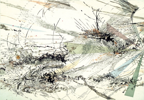
Julie Mehretu. “Diffraction,” 2005. Color sugar lift aquatint with aquatint, spit bite aquatint and hard ground etching on gampi paper chine collé. Plate: 27¾ x 39¾ in.; sheet: 35½ x 46¾ in. Publisher and printer: Crown Point Press, edition of 35. Image courtesy Crown Point Press, San Francisco.