Articles by Ben Street
Letter from London
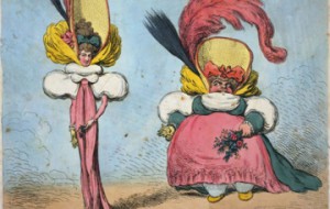
Letter from London: Remember, remember…
Letter from London
Letter from London: Remember, remember…
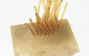
In a recent interview in the New Yorker, artist-of-the-moment Urs Fischer said something about how art and memory work together. I can’t remember the exact quote. It was something about …

Letter from London
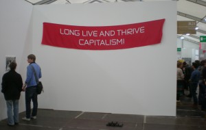
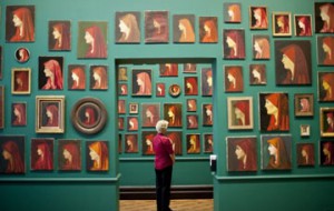
Letter from London: Pop Life (It’s The Only Life I Know)
Letter from London
Letter from London: Pop Life (It’s The Only Life I Know)
It’s not cool to be depressed by the brazen commercialism of certain facets of the art world, yet you’d have to have a heart of stone not to leave Pop …
Letter from London
Letter from London: Beck to the Future!
Letter from London
Letter from London: Beck to the Future!
[youtube:https://www.youtube.com/watch?v=VkcvrV4UhTM] The “cultural cringe” – the crippling inferiority complex that members of a particular country feel about their homeland, as evidenced in the bluffed provenance of just about every college …
Letter from London
Letter from London: Hot Scots, Part Deux
Letter from London
Letter from London: Hot Scots, Part Deux
Sometimes the most interesting thing about an artist is the disparity between their work and the established perception of it. Eva Hesse, the late German-American sculptor of ratty latex and …

Letter from London
Letter from London: Hot Scots, Part Un
Letter from London
Letter from London: Hot Scots, Part Un
In a big, sprawling, multi-tentacular artsfest like the Edinburgh Festival, certain forms of art – like, say, one-woman mime interpretations of the career of Robin Williams, or freestyle macrame workshops …

Letter from London
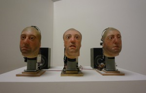
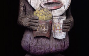
Letter from London: Jeff – Dumb and Blind(ing)
Letter from London
Letter from London: Jeff – Dumb and Blind(ing)
In Herbert Ross’s magisterial 1987 film The Secret of My Success, Michael J. Fox plays Brantley Foster, a charming chancer who works his way up (spoiler alert!) from mailroom to …

Letter from London
Letter from London: Everybody Be Cool, This Is An Art Gallery!
Letter from London
Letter from London: Everybody Be Cool, This Is An Art Gallery!
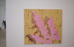
If Abstract America, the new show of contemporary American painting and sculpture at the Saatchi Gallery, were a film, it’d be one of those earnest indie dramas made for hipster …

Letter from London
Letter from London: Turner Round, Bright Eyes!
Letter from London
Letter from London: Turner Round, Bright Eyes!
I don’t know: maybe there will be a time when the announcement of the Turner Prize nominees won’t be greeted with a tiresome trotting-out of hoary old journalistic cliches (yes, …

Letter from London
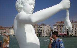
Letter from London: Plinth of Thieves
Letter from London
Letter from London: Plinth of Thieves
Good news! We’re living in “a golden age of public art,” characterized by “a change in art’s very nature, from an aesthetic, spiritual and intellectual function to a principally social …

Letter from London
Letter from London: See you later, contemporary art curator!
Letter from London
Letter from London: See you later, contemporary art curator!
Pity the poor curator, scapegoat of the contemporary art sceptic. It’s hard not to feel at least a little sorry for Nicholas Bourriaud, curator of Tate Britain’s Altermodern, who has …


Letter from London
Letter from London: Remember, remember…
Letter from London
Letter from London: Remember, remember…
In a recent interview in the New Yorker, artist-of-the-moment Urs Fischer said something about how art and memory work together. I can’t remember the exact quote. It was something about …

Letter from London
Letter from London: Pop Life (It’s The Only Life I Know)
Letter from London
Letter from London: Pop Life (It’s The Only Life I Know)
It’s not cool to be depressed by the brazen commercialism of certain facets of the art world, yet you’d have to have a heart of stone not to leave Pop …
Letter from London
Letter from London: Beck to the Future!
Letter from London
Letter from London: Beck to the Future!
[youtube:https://www.youtube.com/watch?v=VkcvrV4UhTM] The “cultural cringe” – the crippling inferiority complex that members of a particular country feel about their homeland, as evidenced in the bluffed provenance of just about every college …
Letter from London
Letter from London: Hot Scots, Part Deux
Letter from London
Letter from London: Hot Scots, Part Deux
Sometimes the most interesting thing about an artist is the disparity between their work and the established perception of it. Eva Hesse, the late German-American sculptor of ratty latex and …
Letter from London
Letter from London: Hot Scots, Part Un
Letter from London
Letter from London: Hot Scots, Part Un
In a big, sprawling, multi-tentacular artsfest like the Edinburgh Festival, certain forms of art – like, say, one-woman mime interpretations of the career of Robin Williams, or freestyle macrame workshops …

Letter from London
Letter from London: Jeff – Dumb and Blind(ing)
Letter from London
Letter from London: Jeff – Dumb and Blind(ing)
In Herbert Ross’s magisterial 1987 film The Secret of My Success, Michael J. Fox plays Brantley Foster, a charming chancer who works his way up (spoiler alert!) from mailroom to …

Letter from London
Letter from London: Everybody Be Cool, This Is An Art Gallery!
Letter from London
Letter from London: Everybody Be Cool, This Is An Art Gallery!
If Abstract America, the new show of contemporary American painting and sculpture at the Saatchi Gallery, were a film, it’d be one of those earnest indie dramas made for hipster …


Letter from London
Letter from London: Turner Round, Bright Eyes!
Letter from London
Letter from London: Turner Round, Bright Eyes!
I don’t know: maybe there will be a time when the announcement of the Turner Prize nominees won’t be greeted with a tiresome trotting-out of hoary old journalistic cliches (yes, …

Letter from London
Letter from London: Plinth of Thieves
Letter from London
Letter from London: Plinth of Thieves
Good news! We’re living in “a golden age of public art,” characterized by “a change in art’s very nature, from an aesthetic, spiritual and intellectual function to a principally social …


Letter from London
Letter from London: See you later, contemporary art curator!
Letter from London
Letter from London: See you later, contemporary art curator!
Pity the poor curator, scapegoat of the contemporary art sceptic. It’s hard not to feel at least a little sorry for Nicholas Bourriaud, curator of Tate Britain’s Altermodern, who has …