What’s so shocking about contemporary art?
Teaching with Contemporary Art
Art21 Extended Play
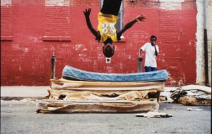
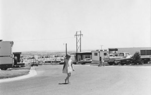
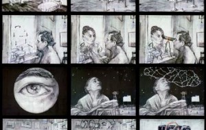
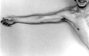
Ambiguity and Teaching with the Photography Robert Adams
Teaching with Contemporary Art
Art21 Extended Play
Ambiguity and Teaching with the Photography Robert Adams
Teaching with and sharing Robert Adams’ photography with students can allow for a broader understanding of what makes a great picture.
Teaching with Contemporary Art
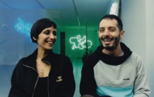
Talking with Janine Antoni and Getting Set for NAEA: Part One
Teaching with Contemporary Art
Talking with Janine Antoni and Getting Set for NAEA: Part One
This week’s column features a brand, new interview with Janine Antoni in advance of her upcoming keynote address and workshop at the National Art Education Association’s annual conference on March 1st here in New York City.
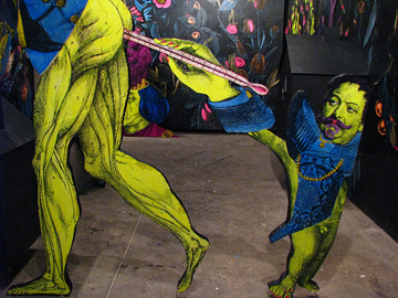
Turkish and Other Delights
Turkish and Other Delights | Şener Özmen
Turkish and Other Delights
Turkish and Other Delights | Şener Özmen
While preparing to travel to Diyarbakır, the largest city in southeastern Turkey, I discovered that telling Turkish people who live outside of that region that you’re going to visit Diyarbakır …
Teaching with Contemporary Art
Art21 William Kentridge: Anything is Possible
Reflecting on Teaching with William Kentridge: Anything Is Possible
Teaching with Contemporary Art
Art21 William Kentridge: Anything is Possible
Reflecting on Teaching with William Kentridge: Anything Is Possible
This past Saturday I sat down with a small group of wonderful teachers at the Jacob Burns Film Center’s Media Arts Lab for the second part of a two-part workshop …

Teaching with Contemporary Art
Teaching with Contemporary Art: The First Three Years
Teaching with Contemporary Art
Teaching with Contemporary Art: The First Three Years
This week Teaching with Contemporary Art here on the blog turns 3. Frankly, I can’t believe that I’ve been writing this column for three years. At the same time, it …
Open Enrollment
Open Enrollment | Los Angeles: Nice Meeting You Again and Again
Open Enrollment
Open Enrollment | Los Angeles: Nice Meeting You Again and Again
This week began with Dean Rochelle Steiner of the USC Roski School of Fine Arts signing off on my thesis and me paying the publishing and binding fee. My thesis …

Turkish and Other Delights
Turkish and Other Delights | biriken
Turkish and Other Delights
Turkish and Other Delights | biriken
biriken is the five year old interdisciplinary, collaborative project of Melis Tezkan and Okan Urun. Working at the intersection of performance art, installation art, and traditional theater practice, Tezkan and …

Looking at Los Angeles
Looking at Los Angeles: Owning Robert Mapplethorpe
Looking at Los Angeles
Looking at Los Angeles: Owning Robert Mapplethorpe
“I don’t know why my pictures come out looking so good,” photographer Robert Mapplethorpe once told his brother. “I just don’t get it.” He had that innate knack for …


Letter from London
Letter from London | Porn, Porn Everywhere: Analog at Riflemaker Gallery.
Letter from London
Letter from London | Porn, Porn Everywhere: Analog at Riflemaker Gallery.
In this second and last guest blog post, Kerim Aytac fills in for our hero Ben Street this month. — Ed. Looking at Richard Nicholson’s elegiac contribution to the Analog …
Teaching with Contemporary Art
Teaching with David Wojnarowicz (and Not Teaching with the Smithsonian)
Teaching with Contemporary Art
Teaching with David Wojnarowicz (and Not Teaching with the Smithsonian)
In light of the recent debacle at the Smithsonian involving the removal of David Wojnarowicz’s A Fire in My Belly, I thought it might make sense to suggest some ways …
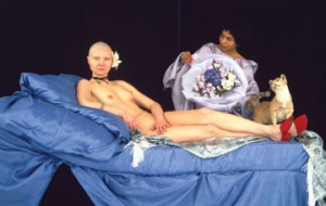
Flash Points
“Imperfect Moments: Mapplethorpe & Censorship Twenty Years Later” at ICA in Philadelphia
Flash Points
“Imperfect Moments: Mapplethorpe & Censorship Twenty Years Later” at ICA in Philadelphia
Last week, people from far and wide gathered for a special conference titled “Imperfect Moments: Mapplethorpe and Censorship Twenty Years Later,” which was co-presented by the Institute of Contemporary Art …
Flash Points
Teaching with Contemporary Art
Myths, metaphors, and more: Interview with Eleanor Antin, Part 1
Flash Points
Teaching with Contemporary Art
Myths, metaphors, and more: Interview with Eleanor Antin, Part 1
Last month I had the good fortune to speak with Eleanor Antin (Season 2) in a series of lively and engaging emails that included her thoughts on preparing for exhibitions, …

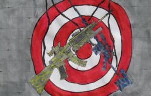
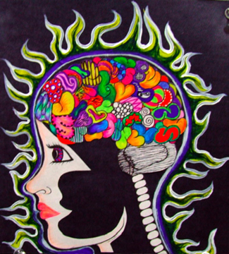
Flash Points
Using contemporary art to help open conversations
Flash Points
Using contemporary art to help open conversations
What’s the place of contemporary art in schools? What’s the place of “controversial” contemporary art in schools? And what’s our responsibility as teachers? The very best contemporary art speaks a …

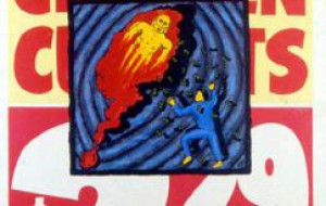
Flash Points
Difficulty, Part 1: Deceptive Forms of Simplicity
Flash Points
Difficulty, Part 1: Deceptive Forms of Simplicity
What if, instead of talking about what makes an artwork controversial, we focused on what makes an artwork difficult? Difficulty has long functioned as a keyword in poetics and music …
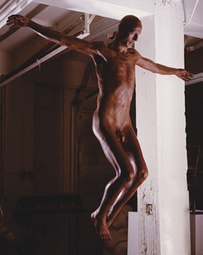
Flash Points
Sweet Jesus! Shock, awe, and the mundane
Flash Points
Sweet Jesus! Shock, awe, and the mundane
As readers’ comments suggest in the introductory post of Flash Points, contemporary art that engages religion is a hotbed for controversy. James Horn remarks, “I have seen pictures which have …